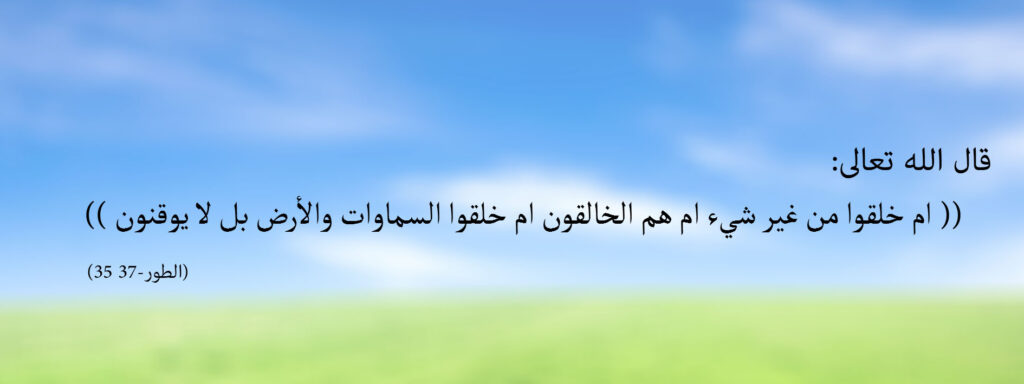
A typeface can look attractive on a large design monitor while its dots and diacritics become hard to distinguish in a chat. Begin at the size the reader will actually see. Display a copy at ordinary phone width and read it without zooming. That gives you a more useful test than judging an enlarged canvas inside the design application.
Fix the wording before comparing fonts
Keep a reference copy of the quotation and its source as readable text. When you change the font or weight, compare the result character by character with that copy. Do not remove existing diacritics just to gain space, or insert words and punctuation to balance a line. A shortened description should be clearly separate from the quotation rather than presented as the same wording.
The W3C Arabic and Persian layout working draft discusses joined letters, diacritics, and text direction. For a practical visual check, look closely at dots and marks after selecting a font, especially where several marks sit near one another. Test a longer word and the smaller reference line as well as the title.
Build a readable hierarchy
Separate the title, main text, and reference through size, weight, and spacing. One clear family with two useful weights is often easier to manage than several competing typefaces in a small card. A reference may be smaller than the quotation, but it still needs to be readable without extreme zoom. Leave enough room between lines that upper and lower marks do not collide with neighbouring text.
Use a background that does not hide strokes or dots. If lettering crosses a busy image, try placing it in a quieter area or reducing the elements behind it. Decoration can contribute to a composition, but it cannot repair text the reader cannot distinguish. Keep space around the wording so it does not touch the artwork edge or nearby application controls.
Check direction and the exported file
When Arabic appears beside a reference number or an English heading, inspect the order of numbers and brackets after export. Do not mirror the artwork to match a page direction: mirroring also reverses its letters. Open the final image in another application and compare the complete wording with your reference copy again.
The At-Tur verses 35–36 card provides an example with readable text beside the artwork. Use it to compare the two representations; its presence in the library is not automatic permission to edit the file. Check the usage terms and enquire about an appropriate version if the original format does not fit your task.